It’s not that I’m planning to run down to my local (or semi-local) Apple store and get in line for an iPhone. I’m not a big cell phone user; I can go weeks without turning mine on. I work from home, so it’s not like I need one most of the time since I spend most of my days within reach of my Mac Pro and a broadband connection. It was just idle curiosity that led me to the page on the Apple site that details whether a given Apple store or set of stores currently has stock of the new new thing.
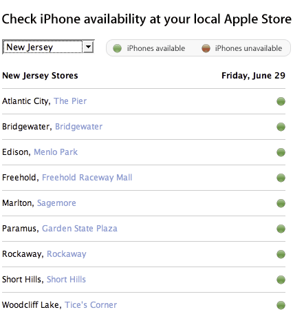
So do they? Hell if I know. Apple, which got rid of its fabled human interface group shortly after his Steveness returned, has made one of the most basic mistakes on this page, relying solely on color to convey meaning. If there are iPhones available, there’s a dot that’s presumably green. If there are no iPhones available, there’s a dot of exactly the same shape and size that’s presumably red. I say presumably because as one of the roughly 7 to 10% of males who suffer from colorblindness, I can’t tell the difference between the goddamned things. The page is completely opaque to me.
Apple has a long history of making this particular mistake. They had a similar page a few years ago that showed whether iDVD-authored DVDs worked on a given DVD player or not. The dots were smaller, but the mistake was the same. I once spent 20 minutes on the phone with Apple technical support trying to figure out if my Airport Base Station was broken or not because I couldn’t tell the poor guy if the status LED was red or green. My wife finally came home and was able to clear up the question of the color in two seconds, and three seconds after that the tech support guy was filling out a form so I could send my broken base station back to the mother ship.
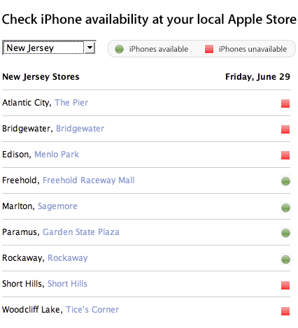
It’s really easy to avoid this problem. Use different shapes. Use words. Use something, but don’t use the same freaking shape and two colors known to be difficult-to-impossible to differentiate for a large percentage of your customer base.
I’m sure the design wizards at Apple could come up with something more aesthetically appealing than my five minute mockup here.
This is a relatively small problem in the great scheme of things. But when people ask why I care so much about how accessible the web is to blind people, for example, this is a small taste of the frustration people using screen readers or magnifiers have to put up with every time they use the web. It doesn’t have to be this way. It just requires developers to think a little and feel a little empathy for their users, and be aware of how to avoid potential pitfalls like this.
Posted at 7:30 PM
Link to this entry || 4 comments
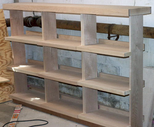
It’s just under four years since we moved into the house, and unpacking proceeds apace. We left our LPs in boxes since we moved because we didn’t have anything to hold them other than the wooden crates we’d been using before. I really wanted to make something nice to hold them, and I really intended to do it long before now, but, well, you know.... Anyway, last autumn I started working on a bookcase to hold all our LPs. I came up with a design, got the wood I needed, and set to work. I made it in maple, with maple plywood for the shelves and dimensional lumber for the supports and trim. By September, I had the actual construction finished.
I really wanted to make sure these came out well, so I took some time to research finishing, since this was my first really serious piece of furniture. I decided that tung oil was the way to go. Unfortunately, by the time I figured this out, it was cold out, and you need to apply tung oil in a well-ventilated place at a reasonable temperature. This means the garage, and it was too cold to do by that time. So the bookcase wintered in the basement.
By May, the temperatures outside were reliably warm enough for long enough stretches that I figured I could do the work. I moved my workshop out to the garage, did a final sanding of the pieces. I built the bookcase in five pieces, three carcasses of shelves, a frame for the toe kick, and a cap to sit on top and unify the whole thing. That way I could carry it into the house by myself piece-by-piece and assemble it in the spare bedroom that serves as our media library.
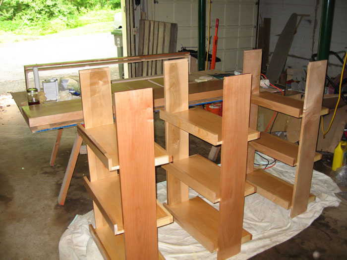

It took me about two weeks to apply the finish to the wood. I started with a couple of coats of sealer, which has a dull finish, and then added five or six coats of a glossier coat. The oil seeps into the wood and hardens with exposure to air. Each coat needed about 24 hours to dry, so I was limited to one coat a day, which took me just under an hour to apply.
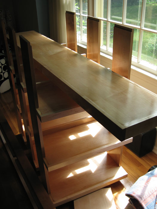
By last weekend, I had completed the finishing. On Sunday morning, I moved the dried and finished pieces of the bookcase into the living room so I could assemble it at my leisure. I had to move the boxes of LPs out of the way first, but by Sunday evening I was able to place the toe kick frame in the room. Monday evening, I put the rest of the pieces in place, tested to make sure the cap fit correctly while also extending back to the wall, then removed the cap and glued the tops of the carcasses into place where they would ensure that the cap fit as intended. By Tuesday morning, I was able to place the cap on top and declare the bookcase installed.
It took me a couple more days to unpack the 16 boxes of LPs. Mine were largely alphabetized already, so that wasn’t too bad. Laura’s weren’t, so I alphabetized them and integrated them so that we can find anything we want quickly.

I’m really happy with the way the bookcase turned out. There are roughly 18 linear feet of shelves holding somewhere in the neighborhood of 2000 LPs, and as you can see, I did a pretty good job of estimating how much space we needed. There’s not a whole lot of extra space. It took rather longer than I expected to finish, but I’m pleased with the end result. It probably wasn’t the most efficiently made piece of furniture; with a bit more experience, I probably could have lessened the amount of raw lumber I used on the piece by creating better cutlists that left less scrap wood, for example. I could point out the errors and flaws, but mostly they don’t matter because they’re hidden by the records, and besides, I think more worked out well than didn’t with this. I had a lot of fun making my first serious piece of furniture. I don’t know that I’ll make a lot of furniture for the house, but I definitely have plans for at least a couple more pieces.
Posted at 12:27 AM
Link to this entry || 5 comments