
Groovy '60s Sounds from the Land of Smile!
Thursday, June 28, 2007
Inaccessible Apple
It's not that I'm planning to run down to my local (or semi-local) Apple store and get in line for an iPhone. I'm not a big cell phone user; I can go weeks without turning mine on. I work from home, so it's not like I need one most of the time since I spend most of my days within reach of my Mac Pro and a broadband connection. It was just idle curiosity that led me to the page on the Apple site that details whether a given Apple store or set of stores currently has stock of the new new thing.
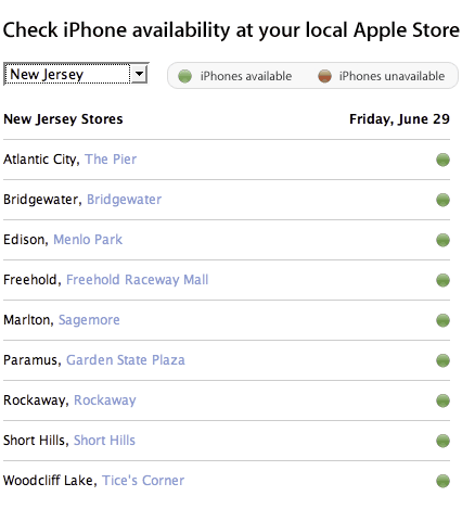
So do they? Hell if I know. Apple, which got rid of its fabled human interface group shortly after his Steveness returned, has made one of the most basic mistakes on this page, relying solely on color to convey meaning. If there are iPhones available, there's a dot that's presumably green. If there are no iPhones available, there's a dot of exactly the same shape and size that's presumably red. I say presumably because as one of the roughly 7 to 10% of males who suffer from colorblindness, I can't tell the difference between the goddamned things. The page is completely opaque to me.
Apple has a long history of making this particular mistake. They had a similar page a few years ago that showed whether iDVD-authored DVDs worked on a given DVD player or not. The dots were smaller, but the mistake was the same. I once spent 20 minutes on the phone with Apple technical support trying to figure out if my Airport Base Station was broken or not because I couldn't tell the poor guy if the status LED was red or green. My wife finally came home and was able to clear up the question of the color in two seconds, and three seconds after that the tech support guy was filling out a form so I could send my broken base station back to the mother ship.
It's really easy to avoid this problem. Use different shapes. Use words. Use something, but don't use the same freaking shape and two colors known to be difficult-to-impossible to differentiate for a large percentage of your customer base.
I'm sure the design wizards at Apple could come up with something more aesthetically appealing than my five minute mockup here.
This is a relatively small problem in the great scheme of things. But when people ask why I care so much about how accessible the web is to blind people, for example, this is a small taste of the frustration people using screen readers or magnifiers have to put up with every time they use the web. It doesn't have to be this way. It just requires developers to think a little and feel a little empathy for their users, and be aware of how to avoid potential pitfalls like this.
Tags: iPhone Apple accessibility design
Posted at 7:30 PM
Comments
Note: I’m tired of clearing the spam from my comments, so comments are no longer accepted.
I'm not color-blind, but I can barely tell the difference between the green and red.
Very poor UI design.
i thought of this post when i ran across an interesting feature at neighboroo.com/ - there's an "R-G Color Blind?" link that changes the display to blue and yellow. Interesting, but makes me wonder why they didn't just use red and blue (or green and yellow) to start with?
Posted by shirley at 12:18 PM, July 16, 2007 [Link]
Actually, that is kind of funny in a sad way. The worlds most powerful design horse not thinking enough about this. Ironical.
Trackbacks
This site is copyright © 2002-2024, Ralph Brandi.
What do you mean there is no cat?
"You see, wire telegraph is a kind of a very, very long cat. You pull his tail in New York and his head is meowing in Los Angeles. Do you understand this? And radio operates exactly the same way: you send signals here, they receive them there. The only difference is that there is no cat."
- Albert Einstein, explaining radio
There used to be a cat
![[ photo of Mischief, a black and white cat ]](/images/moosechief.jpeg)
Mischief, 1988 - December 20, 2003
![[ photo of Sylvester, a black and white cat ]](/images/conehead_sm.jpeg)
Sylvester (the Dorito Fiend), who died at Thanksgiving, 2000.
Stylesheets
![]()
![]()
![]()
new host
Me!
- Home Page
- Resume
- Married
- Photographs
- Flickr Photostream
- Instagram Archive
- Twitter Archive
- Allergic to cats :-(
![]()
There Is No Cat is a
 Ralph Brandi
joint.
Ralph Brandi
joint.
Archives
Search
Family Blogs
Blogs I Read
- 2020 Hindsight
- AccordionGuy
- Adactio
- Allied
- Apartment Therapy
- Assorted Nonsense
- Backup Brain
- Burningbird
- Chocolate and Vodka
- Creative Tech Writer
- Critical Distance
- Daily Kos
- Dan Misener likes the radio
- Daring Fireball
- Design Your Life
- design*sponge
- Doc Searls
- Edith Frost
- Elegant Hack
- Emergency Weblog
- Empty Bottle
- Five Acres with a View
- Flashes of Panic
- Future of Radio
- Groundhog Day
- Hello Mary Lu
- iheni
- Inessential
- Interllectual
- Jeffrey Zeldman Presents
- Jersey Beat
- John Gushue ... Dot Dot Dot
- john peel every day
- JOHO The Blog
- Kathryn Cramer
- Kimberly Blessing
- La Emisora de la Revolucion
- Lacunae
- Loobylu
- mamamusings
- Medley
- mr. nice guy
- MyDD
- Orcinus
- oz: the blog of glenda sims
- Pinkie Style
- Pinkie Style Photos
- Pop Culture Junk Mail
- Seaweed Chronicles
- Shortwave Music
- Slipstream
- Talking Points Memo
- The Unheard Word
- Tom Sundstrom - trsc.com
- Typographica
- Unadorned
- Vantan.org
- WFMU's Beware of the Blog
that's UI design 101, my friend. redundant coding. apple needs a clue on this one.
Posted by shirley at 9:47 AM, June 29, 2007 [Link]